
Amazing photoshoot


Amazing photoshoot
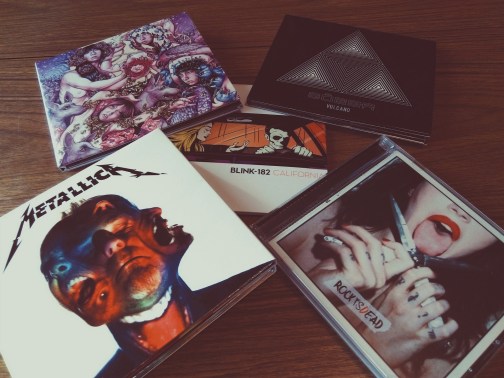
The end is near … the end of the year, hahaha … for this reason I share with you my favourite records of this year 2016.
Metallica – Hardwired … To Self-Destruct
Blink 182 – California
Dorothy – Rock Is Dead
Sôber – Vulcano
Baroness – Purple

One of my photos will be used to the next VSCO X POWERBAR CAMPAIGN!

Sunsets …


Killler shoots … enjoy the galleries!


… and finally the Night gallery:


Pretty cool uh?


Brilliant


Two BLINK 182 vinyls in a few days …


BY STEFFAN CHIRAZI
Despite the onslaught of digital music, Metallica still retains a deep and tangible desire to produce album artwork which offers both some “wow” factor and (more importantly) an aesthetic which partners with the vibe and feel of the album. Through Lars Ulrich’s friendship with an English gentleman called David Turner, Metallica started working with design and branding firm Turner Duckworth on the Death Magnetic album. Turner Duckworth are better known for their work with the likes of Coca-Cola and Amazon, but this has been a different adventure involving their wider ability to bring fresh, outside, creative perspective to a genre and landscape which doesn’t always get that. Subsequent packages for Lulu and Through The Never have continued the fruitful creative relationship, and Hardwired…To Self-Destruct (with Herring & Herring’s exceptional photography) is the best overall package yet. We sat down with Jamie McCathie (Creative Director) and Tyler Brooks (Lead Designer) to discuss the latest collaboration, and why it will be a long time before anyone sees skulls, studs or heavy metal hornage on a Metallica release.
Steffan Chirazi: Let’s start with the color white. You know, Metallica is known as a “black” band, so how on earth have they switched to being “white”? Lulu and Death Magnetic were first, so let’s talk a little bit about how white has prevailed as the lead color.
Jamie McCathie: Interestingly, when we were working on the Hardwired… album, we were very aware that Death Magnetic and obviously Lulu were white. So we definitely had concepts that didn’t include that color because we didn’t want it to be a theme necessarily. Overall, there was a very strong feeling that what this cover should be is much more modern, much more “conceptual,” [and] feel more like an art piece than your average heavy metal album cover. And that came directly from the band. They wanted to do something really different, not using cliché imagery. And they’re not afraid to do something that’s gonna stand out from the crowd. I think white has been a part of that, and unintentionally, it has helped some of the artwork that’s been released in the previous years feel really modern, fresh, and clean. White really gives us a simple background color to enable that really striking, iconic image to stand out and play its bigger role.
SC: Right. Let’s talk about the cliché image for a little bit. I mean, before you got this directive from the band, if you had been left to your own devices and you’d been given a title of Hardwired…To Self-Destruct, what is your first thought?
JMC: When we presented [at] the concept stage, we presented probably four ideas in total. And of those ideas, I wouldn’t say that the schizophrenic kind of beast in a struggle was our first concept by any means. There were plenty of different concepts. Something that came up was obviously, [with] “self-destruct” we think of fire, we think of explosions, we think of things like that. So there’s some trips there that obviously first came to mind. But, you have to exorcize those demons before you get to something that’s different, that’s unexpected.
SC: So what’s interesting is, in what you’ve said, I would counter that you’ve actually ended up managing to crystallize some of those elements within what Herring & Herring did. Do you think that perhaps there was an initial seed of that idea, or were you simply working with the photography you got and it just was happy coincidence?
JMC: No, I would absolutely agree that the cover image itself and all of the photography has this explosive kind of energetic feeling. So yeah, when we first got the photography, and I was at the photo shoot as well, we started to work with the elements and we knew that we wanted to make sure that it didn’t look like the band members, that at your first glance you’re like, “Oh, that’s a crazy image!” And thenwhen you looked a little deeper you saw the band members. We knew we wanted to combine elements to make one striking image. I think it was a happy accident that has really worked well for this artwork.
SC: Interesting, and I think this is something that I’d really like to detail for the readers. Who is responsible for putting the images together? I assume that you got individual shots with each guy with the projections on them and I presume that the assembly process has happened at Turner Duckworth. Is that right?
JMC: Yeah! Many times we’ve done albums with a band whereby you get given photography at the end and it’s like your average black and white photograph, and then you start to figure out how it works within the overall artwork like within the booklet. Whereas with this, we knew that we had something special, beyond just a booklet, so it had to feature on the cover. It was just too good not to. It was after they brought the color combination head concept to the cover itself, and the other photography worked in pieces throughout the inner inside of the booklet and the sleeve jackets from the vinyl, making this really rich, overall packaging look and feel.
SC: So the pieces, the composite pieces, the covers for the deluxe and for the standard editions, those are pieces that you collaged yourself. And can I ask, did you select the images that were collaged, or were you given a selection by Herring & Herring, “Hey, here’s three of Lars, here’s three Robs, here’s three, three, and you make what you will of these but please don’t go outside this, you know, selection of twelve or sixteen,” whatever the breakdown was? How did that work?
JMC: We said to them, “Hey, we found these images. We put them together. What do you think, Herring & Herring?” But I want to make it clear as well that although we kind of put the heads together, then we’d talk to Herring & Herring, they really helped to retouch those final images. They’re absolutely as collaborative as we are in the kind of combination of the final art of those heads and the faces and the positions as well. But it was between the two of us, for sure.
Tyler Brooks: Yeah, there’s a huge library to pick from, and obviously Herring & Herring had sort of [theirs] and we wanted to be respectful of those definitely and so I think throughout the artwork we celebrated those. Then with the collages of heads, I was looking through the library, seeing what kind worked, trying to find a way to create different feelings with the different collages. It’s a real challenge to find a way to create different feelings within the collages. So we tried to find a range, tried to play around and see what worked together, and then obviously being respectful of the imagery itself, saying, “Hey guys, you know, this is what we’ve come up with. What do you think? Do you think we should swap out here and here?” So yes, as Jamie said, definitely it’s a really collaborative process and we’re really proud of that.
SC: How involved have you two got in talking to the band, mapping their emotions and what kind of people they are? And I’ll tell you why, because I know that there was one image that really struck me where Lars is screaming inside James’ head… I cannot begin to tell you the pleasure that that gives him, you know, the mere fact that he is “inside James Hetfield’s head” is something that he’s gone on about. So did you sit down and chat with them to get a read on the personalities to help you inform these collages?
JMC: Yeah, like I mentioned I was at the photo shoot overseeing, and that was before we knew about the overall collages, it was more the concept of projections on faces. And so when I was there overseeing, we were with the band talking about the concepts. We met a few times before the presentation as well because we needed to understand a little bit about the name [of the record]. Like, what’s the meaning behind the album? What are you trying to portray? Because that’s really important to us. We’re visual communicators, so we wanted to know what the overall idea was. And when we saw the images come in, as someone who’s been a fan for a really long time, to see those images, particularly between Lars and James, they’re pretty striking; they’re so strong.
SC: One weird question for you…the brain scans. I mean come on. Whose brains are those?
JMC: Unfortunately it’s not quite the band’s brains. That’s obviously the concept that we’re going for. The timing wouldn’t have allowed us to get all of those brain scans in time, so it’s combos, different pieces of imagery that were found and purchased and used, I mean obviously with the intent that it feels and looks like inside their skulls. I mean, we’ve really messed with them. It’s not like you can go to a stock image library and find that explosion inside of a brain.
SC: There’s got to be some train spotter somewhere who’s gonna take a part of the cerebral cortex and try and figure out who it belongs to (frankly it’d be me if I had more time!).
TB: Who knows? Maybe they’ll diagnose something in there!
SC: I want to go back to this concept of presenting the art versus maybe going for the cliché. Do you think that Metallica has broken a mold in heavy metal with the last few packages? Is there anyone who you think has got this close to doing that? I mean, this is art and it is not a typical sleeve.
JMC: Yeah, well, I think that whether they’re the only kind of metal band to have broken it is one thing. I think that they are just very aware that this is a format in which to do something incredibly different. With every album cover that we as a company have done with Metallica, we want to do something different. It shouldn’t just look like another metal album. And that’s why I think our relationship has lasted so long and, rather than just being David and Lars’ relationship, it’s been a whole working relationship where we are both committed to try and do something different to make that client stand out and be the best they can be. It has to be something really different [each time] and the band really pushed us on that as well. You know some of the concepts, as Tyler mentioned, probably felt more like what people would expect a Metallica album to look like, but the band were adamant that that was not gonna be the case.

SC: I’m looking at the back of the deluxe box set and, for the life of me, that looks incredibly like a werewolf type image. Were you getting to that point with some of these images where it was like, “Hey, you know, we can put the wolf in there and we can put something in there?” Did it get that literal, or is it simply what’s just more visually appealing and if that’s the end result, so be it?
TB: It’s more along those latter lines. I mean funny enough, early on the concepts there are some things in this album that are, if you look at them or read the lyrics, is like this sorta inner beast coming out. So I think it just sort of naturally happened that way, looking like this monster is kind of erupting for example. So we just kinda ran with it. There weren’t any specific intentions of being a werewolf.
SC: I also thought it was very interesting that you’ve chosen to highlight certain lyrics in the lyric layout. Now were you given the license and the liberty to highlight the lines that you felt deserved prominence?
TB: We made those decisions as we looked through the lyrics and as we had recalled some of the songs that we had heard, some of the music. We made those decisions, ran ‘em by the band and management, and made sure that everyone was okay with it. And if they weren’t happy with it they were, you know, very ready to call that out. But I think it’s pretty much unchanged from what we had suggested.
SC: Did you find that once you’re “in” and once they’ve given you the initial validation of trust, you were left to do your own thing?
JMC: Absolutely right. I mean other than the big pressure piece at the start of this project, which was getting what the concept was. But once we got that, they were just excited and they just want you to run with it. So it’s very collaborative, then it’s very, like, “Hey, you guys’ll do it, I can’t wait to see it.” And in time we present it back to them, the pieces, and they’re just really excited, just encouraging us to do what we do. And the same with Herring & Herring; they’re great.
TB: Yeah, everyone was super receptive and any feedback, we took and we made tweaks, any suggestions. Lars and James had sometimes very specific things, like, “Hey, what about this image?” Actually, I recall James saying, “I like the image but it’s not fucked up enough!” Those are his words. And so it’s like, “Okay, we’ll come back with a couple of options, what do you think?”
JMC: We’ll fuck it up more.
TB: Yeah, we’ll fuck it up more. Most of the time it was, “We love it, here’s an idea, think about this.” And then same with Herring & Herring, it was, “Wow, guys, you know, this looks great, thanks for respecting our photos.” So it was pretty cool.
JMC: I was just gonna say, these projects are so incredibly collaborative. It’s a combo of everyone: the band, us, our designers, our production, Herring & Herring’s amazing photography. Very, very collaborative and no holds barred in terms of just getting the best creatives, which is really fun about all of these Metallica projects.

SC: Yeah. Let’s talk as well about the new “fractured” Metallica logo. This is, you know, a pretty big deal. It’s somewhat of a sacred thing to do, but it works and it looks great. How was that received when you first presented a fractured logo?
JMC: They loved it. And when we presented the first stage we had four different concepts. The regular digipak cover that you see was page three in our presentation and the band started laughing! Everyone was like, “Holy fuck, this is like the fucking answer, we don’t want to see any more work!” And this idea of the “glitch” logo, it really works so well with that image of the head. The band just loved it. And it really kind of builds on this kind of “glitchy” type thing that they were kind of fucked up as well, and then that theme runs throughout all of the type and in the booklet. They just loved it. And I think management were kind of at first, “Oh, what have they done to our logo,” but the band was just like, “Yeah, fuck it, why not? Let’s do it.” I mean, we were surprised that it was so easy to get that through and that they loved it.
SC: Finally, there was a concept that this record was going to come out in February. And I’m sure you’re equally aware of the moment that it suddenly got turned around and bumped up. Why don’t you give people an idea of how much of your schedules this project took and from what point to what point that happened? Give that window of time if you would, and how many hours a day it’s taken of your life.
JMC: Sure. We were pretty adamant that we couldn’t communicate a visual without knowing the name of the album, and so that took a while for the band to really land on, and lots of conversations that David [Turner] was involved in with them. Our first “sketchbook” that we went over to HQ with and showed the band some kind of sketchy thoughts was on the eleventh of July.
SC: Eleventh of July, did you say?
JMC: It was eleventh of July, yeah, so that wasn’t us going in saying “this is the album cover.” It’s very much like, “Hey, these are some kind of visual themes we could run with, what do you think?” So that was the eleventh of July. Then the actualpresentation day was on the fifth of August; that’s the first, truly like, “Hey, here’s four album covers you’re gonna see and we’re gonna pick one of these and that’s what we’re gonna go with.” That was on the fifth of August. And then the final production, when was that, Tyler?
TB: Probably about three or four weeks later, so yeah.
JMC: It was a very quick process.
TB: As we released artwork, I think it was the box set first and then we moved on, and the digipak deluxe and then the standard digipak. So July was a little slow, and then once it ramped up, it ramped up. A cover is one thing, but making sure that every part of the unboxing is considered and [then] designing and producing at the same time because of that timeline – it was pretty hectic there.
JMC: The design team were working on it flat out, all day every day for a few weeks and I was heavily included in the project from the very beginning all the way closer to the end. The production team were working on it eight, twelve hours a day and just trying to get all these files out. It takes up a lot of time. It’s a short time frame, but then it’s all in once you’re there so you know, we’re living and breathing it for a good month.
No doubt, a month of proper sleepless nights, as was the Hardwired… way for many. Jamie and Tyler thus slipped off to crash out for a few weeks, and hopefully you’ll agree that the sleepless nights were wholly worth it.

Really cool


Pictured: Kate Beckinsale Ref: SPL1399417 051216 EXCLUSIVE
Picture by: Steve Bagness/Splash News
Splash News and Pictures
Los Angeles: 310-821-2666
New York: 212-619-2666
London: 870-934-2666
photodesk@splashnews.com


